So you’ve named your startup, had a fantastic logo made, and chosen a
great tagline. But don’t put your feet up just yet – what about your business font?
It’s an often neglected part of a new startup’s identity, but the startup font you use is a really important tool in your visual communication armory.
The trouble is, a lot of people think that fonts are all the same therefore it doesn’t matter which one you choose. Not so, my friend. Just like colors, music, and scents, fonts evoke an emotional response. It’s just so subliminal that you might not be aware of it.
Your startup business font will subconsciously say a lot about your startup, so choose wisely. Choose the right one and it will enhance your brand identity and give your customers confidence in your startup.
Choose the wrong one and it will bring into question your credibility as a business. It’s serious stuff we’re dealing with here…
Don’t DIY

Don’t do it yourself – no matter how many funds you think you’ll be saving, you’ll actually be charging yourself a lot more in time. The best way to choose a font for your startup is to call in the professionals.
A professional designer or typographer will be able to give you advice and suggestions when it comes to choosing a font. We’re not talking about crafting you a font from scratch (although we’re aiming for that one day, right?).
Rather, a startup branding professional will be able to point you in the right direction in less time than you can learn to tell the difference between your serifs and your sans.
Nothing beats the real-world experience of an expert in startup design.
Startup Business Fonts 101:
Here’s a quick rundown of some broad categories that startup business fonts fall into:
Serif:
Serif fonts have ‘feet‘:
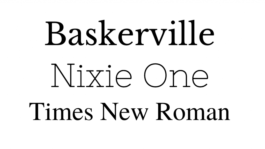
In the world of startup fonts, they’re the mature, traditional ones.
Historically, serif fonts have been around the longest so they’re considered to evoke reliability, confidence, respectability, and authority.
Who uses a serif font? Think well-established corporations like banks and broadsheet newspapers:

Generally, serif fonts can be used for body text, headings, and logos.
Sans Serif:
Sans serifs have no feet:
They’re generally minimal, clean, and simple.
Choosing a sans serif font for your startup will show that you’re modern, straightforward, and approachable.
Think of some of the well-known tech brands you know – Facebook, Uber, YouTube, Twitter – they all use sans serif fonts.

Sans serif fonts are versatile. They’re suitable for body text, headings, and logos.
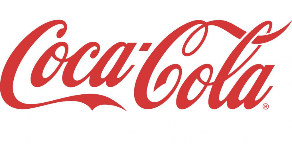
Script:
Script fonts (also called cursive) are ones that emulate handwritten lettering, from handwriting to calligraphy:
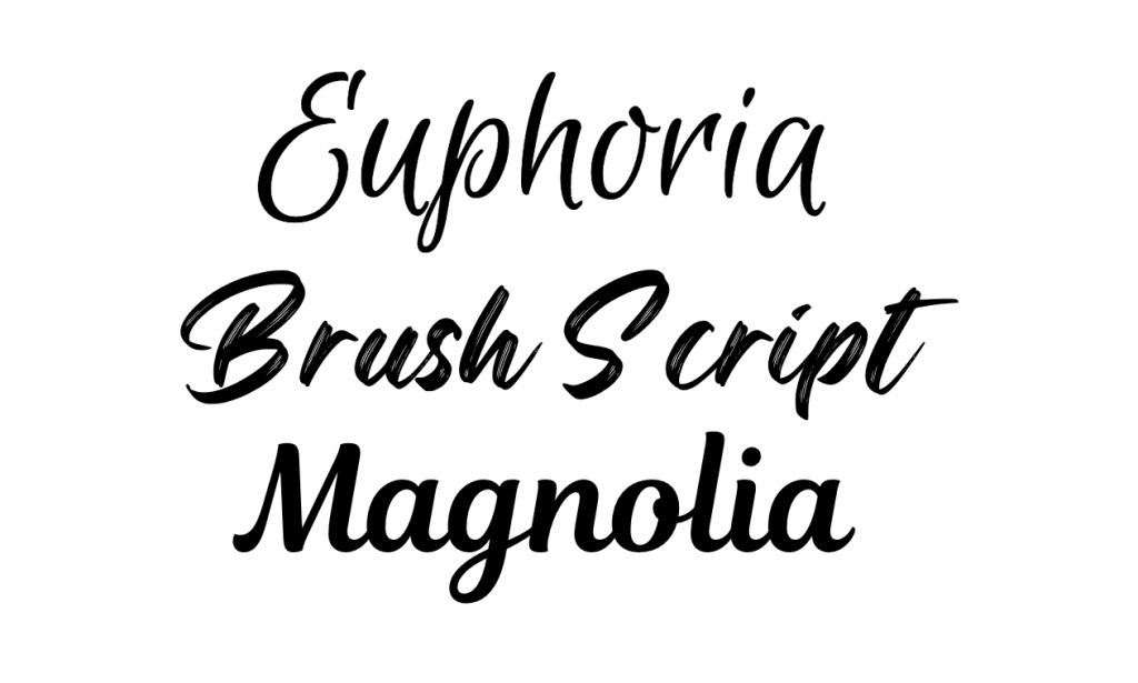
Script fonts conjure up feelings of beauty, femininity, grace, elegance, friendliness, and creativity.
You might have noticed script fonts popping up in more and more places as they enjoy a bit of a trendy resurgence…

Because script fonts can be hard to read, they’re only really suitable for logos. Even large headings can be difficult to decipher in a script font.
If you choose a script font for your logo, you might want to pair it with a sans serif font for headings and body copy.
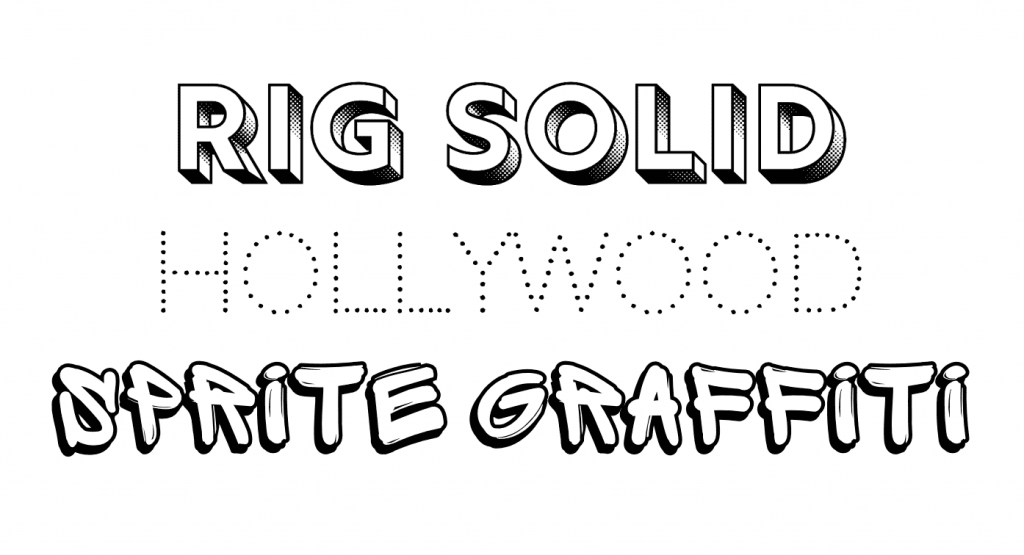
Novelty:
Novelty fonts are just that: gimmicky, loud, and fun:
Beware of gravitating towards novelty fonts for your startup.
Sure, they’re fun and flashy but there’s always a chance the novelty will wear away. Plus, what if your brand changes direction, from youthful and out-there to something a little more tame and classy? If you’re working with pirate font, it may be hard to word that to the investors…
Most people realize this and it’s hard to find a reputable, long-lasting business that uses one for its main business font. Maybe with the exceptions of children’s party entertainment or bouncy castle hire.
As with script fonts, novelty fonts aren’t good for body text or headings. Stick to logos with these fonts too.
What Makes a Good Business Font?
So, now we’ve taken you through the basic font types, what else do you need to know about choosing a startup business font?
The Dependable Workhorse
You might not have considered this yet, but you’ll need to use your font in hundreds of different places. It’ll need to look good no matter what size or where it’s being displayed.
Websites, social media, flyers, emails, headings, letterheads, business cards, apps, logos… the list goes on. Therefore, you need a font that’s versatile. A good old workhorse of a font.
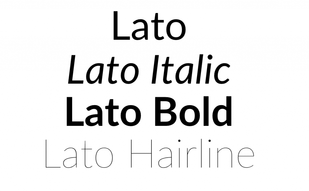
Choose a font that has lots of different weights and styles, then you’ll have every eventuality covered. At the very least it should come in the basic three weights of bold, regular (sometimes called book), and italic.
Will It Work on Web?
This is becoming less of an issue, but it’s still something you should check for.
Not all fonts are suitable for use on the web. And on rare occasions, you might find a font that’s only suitable for use on the web. Check the licensing for any font that you choose – it should have both a desktop and web license (called a Webfont).
Desktop fonts can be downloaded and used on your computer (in a word processor or other software), and web fonts can be directly added to your website’s code.
Recently, some fonts have started adding an app license, which allows you to embed the font file into your mobile app’s code. Nifty.
Free or Paid?
It can be extremely tempting to get a free font for your startup. There are loads of free font sites out there.
However, unless you know what you’re doing you could end up picking a dud. Don’t get us wrong, there are lots of quality free fonts available, but there are far more bad ones.
Quite often free fonts are made by amateur type designers which means they contain rookie errors. To the untrained eye, the differences can be hard to spot. But they’re there, quietly making your startup look inept.
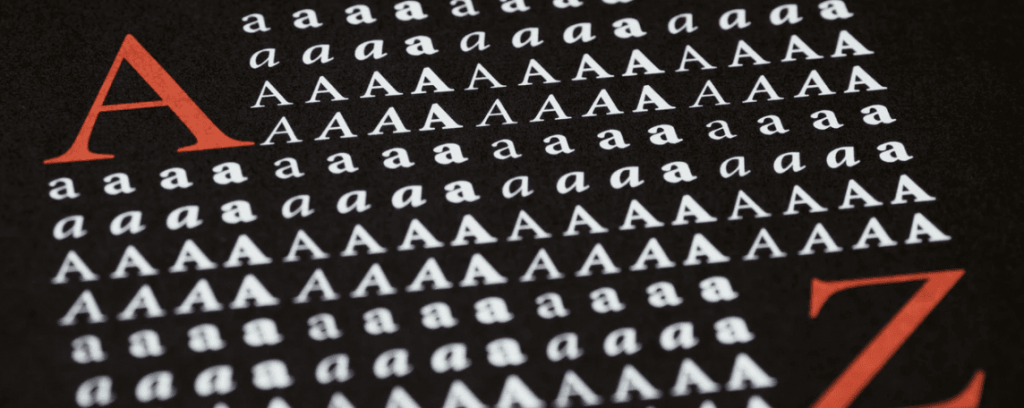
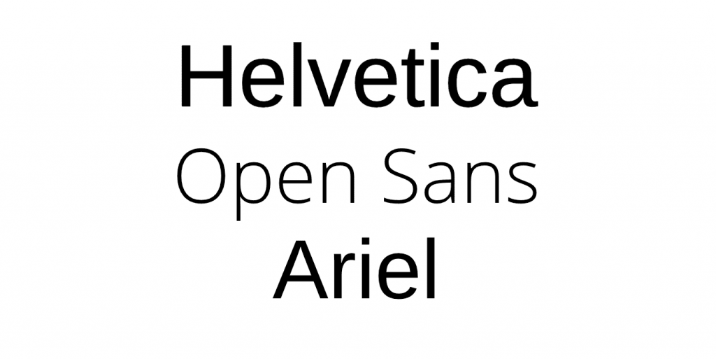
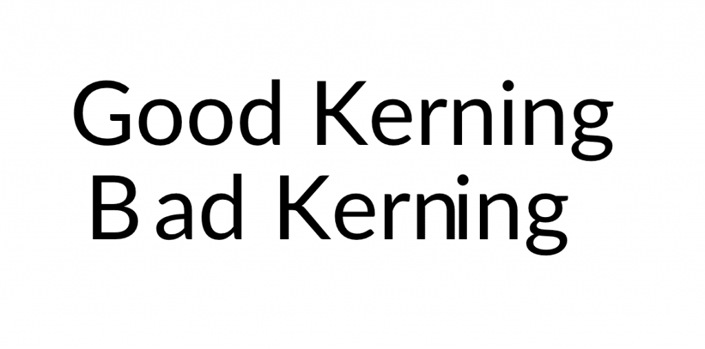
Commonly, you’ll find that the kerning (or spacing between letters) is off. Check out these examples, and the difference proper kerning makes to the overall professionalism of the font:
You might discover your free font doesn’t contain a full character set.
For example, punctuation or numbers haven’t been included. Paid fonts often release a free promo version, which is greatly redacted. Similarly, the free font might only be available in one weight, which is limiting.
Paid fonts are usually professionally made by typographers, so they don’t carry any of the risks that free ones do. There are lots of reputable sites to buy your startup business font from, such as MyFonts or Fonts.com, or of course hiring a specialist designer.
Ready to hire? Our marketplace of over 410,000 freelancers has the skills and expertise needed to skyrocket your business to the next level. From marketers to designers, copywriters to SEO experts – browse the talented bunch here!